A Bayesian approach using R and Brms
For many researchers, outliers are rogue waves that can dramatically alter the course of the analysis or “confound” some expected effects. I prefer to use the term “extreme observations” and leave the term outlier for observations that are not truly part of the population being studied. For example, in my field (brain ischemia research), an outlier is an animal that does not have ischemia (when it should have), while extreme observations are animals with small or large ischemias that are very different from the others.
Traditional (frequentist) statistical models are built on the strong foundation of Gaussian distributions. This has a significant limitation: an inherent assumption that all data points will cluster around a central mean in a predictable pattern (based on the central limit theorem). This may be true in Plato’s world of ideas, but we, scientists in the biomedical field, are aware it’s challenging to rely on this assumption given the limited sampling (number of animals) we have available to make observations.
Gaussian distributions are very sensitive to extreme observations, and their use leads scientists to believe that eliminating extreme observations is the best way to get “clearer” or “cleaner” results (whatever that means). As I once commented in an article as reviewer 2, “The problem is not the extreme observations that may “hide” your effects, but the fact that you are using a statistical model that (I believe) is inappropriate for your purposes”.
It should be noted that no statistical model is the “right” or “appropriate” one, but we can estimate that, given the data, there are certain statistical models that are more likely to generate the observed data (generative models) than others.
Fortunately, nothing forces us to be bound by the assumptions of the Gaussian models, right? We have other options, such as the Student’s t-distribution (1). I see it as a more adaptable vessel to navigate the turbulent seas of real-world biomedical data. The Student’s t-distribution provides a robust alternative to acknowledge that our data may be populated by extreme observations that are normal biological responses that we can expect in any context. There may be patients or animals that don’t respond or overreact to treatment, and it is valuable that our modeling approach recognizes these responses as part of the spectrum. Therefore, this tutorial explores the modeling strategies using Student’s t-distributions through the lens of the brms package for R (2)—a powerful ally for Bayesian modeling
What’s behind a student’s t-distribution?
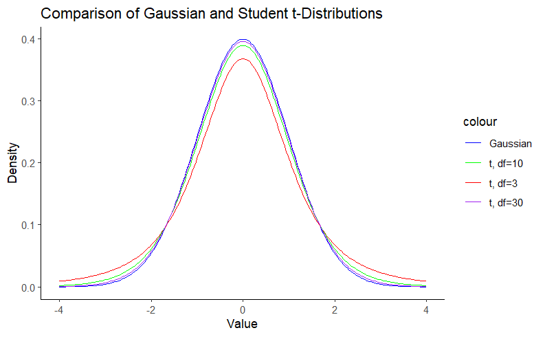
A Student’s t-distribution is nothing more than a Gaussian distribution with heavier tails. In other words, we can say that the Gaussian distribution is a special case of the Student’s t-distribution. The Gaussian distribution is defined by the mean (μ) and the standard deviation (σ). The Student t distribution, on the other hand, adds an additional parameter, the degrees of freedom (df), which controls the “thickness” of the distribution. This parameter assigns greater probability to events further from the mean. This feature is particularly useful for small sample sizes, such as in biomedicine, where the assumption of normality is questionable. Note that as the degrees of freedom increase, the Student t-distribution approaches the Gaussian distribution. We can visualize this using density plots:
# Load necessary libraries
library(ggplot2)

# Set seed for reproducibility
set.seed(123)

# Define the distributions
x <- seq(-4, 4, length.out = 200)
y_gaussian <- dnorm(x)
y_t3 <- dt(x, df = 3)
y_t10 <- dt(x, df = 10)
y_t30 <- dt(x, df = 30)

# Create a data frame for plotting
df <- data.frame(x, y_gaussian, y_t3, y_t10, y_t30)

# Plot the distributions
ggplot(df, aes(x)) +
  geom_line(aes(y = y_gaussian, color = "Gaussian")) +
  geom_line(aes(y = y_t3, color = "t, df=3")) +
  geom_line(aes(y = y_t10, color = "t, df=10")) +
  geom_line(aes(y = y_t30, color = "t, df=30")) +
  labs(title = "Comparison of Gaussian and Student t-Distributions",
       x = "Value",
       y = "Density") +
  scale_color_manual(values = c("Gaussian" = "blue", "t, df=3" = "red", "t, df=10" = "green", "t, df=30" = "purple")) +
  theme_classic()

Note in Figure 1 that the hill around the mean gets smaller as the degrees of freedom decrease as a result of the probability mass going to the tails, which are thicker. This property is what gives the Student’s t-distribution a reduced sensitivity to outliers. For more details on this matter, you can check this blog.
Load the required packages
We load the required libraries:
library(ggplot2)
library(brms)
library(ggdist)
library(easystats)
library(dplyr)
library(tibble)
library(ghibli)
Exploratory data visualization
So, let’s skip data simulations and get serious. We’ll work with real data I have acquired from mice performing the rotarod test.
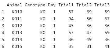
First, we load the dataset into our environment and set the corresponding factor levels. The dataset contains IDs for the animals, a groping variable (Genotype), an indicator for two different days on which the test was performed (day), and different trials for the same day. For this article, we model only one of the trials (Trial3). We will save the other trials for a future article on modeling variation.
As the data handling implies, our modeling strategy will be based on Genotype and Day as categorical predictors of the distribution of Trial3.
In biomedical science, categorical predictors, or grouping factors, are more common than continuous predictors. Scientists in this field like to divide their samples into groups or conditions and apply different treatments.
data <- read.csv("Data/Rotarod.csv")
data$Day <- factor(data$Day, levels = c("1", "2"))
data$Genotype <- factor(data$Genotype, levels = c("WT", "KO"))
head(data)
Let’s have an initial view of the data using Raincloud plots as shown by Guilherme A. Franchi, PhD in this great blog post.
edv <- ggplot(data, aes(x = Day, y = Trial3, fill=Genotype)) +
  scale_fill_ghibli_d("SpiritedMedium", direction = -1) +
  geom_boxplot(width = 0.1,
               outlier.color = "red") +
  xlab('Day') +
  ylab('Time (s)') +
  ggtitle("Rorarod performance") +
  theme_classic(base_size=18, base_family="serif")+
  theme(text = element_text(size=18),
        axis.text.x = element_text(angle=0, hjust=.1, vjust = 0.5, color = "black"),
        axis.text.y = element_text(color = "black"),
        plot.title = element_text(hjust = 0.5),
        plot.subtitle = element_text(hjust = 0.5),
        legend.position="bottom")+
  scale_y_continuous(breaks = seq(0, 100, by=20),
                     limits=c(0,100)) +
# Line below adds dot plots from {ggdist} package
  stat_dots(side = "left",
            justification = 1.12,
            binwidth = 1.9) +
# Line below adds half-violin from {ggdist} package
  stat_halfeye(adjust = .5,
               width = .6,
               justification = -.2,
               .width = 0,
               point_colour = NA)
edv
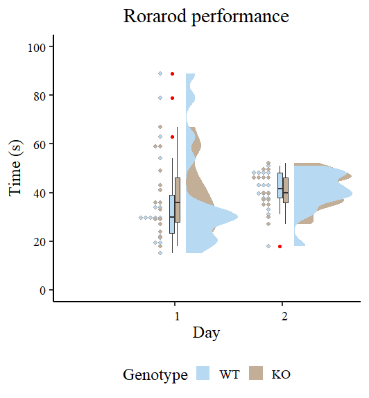
Figure 2 looks different from the original by Guilherme A. Franchi, PhD because we are plotting two factors instead of one. However, the nature of the plot is the same. Pay attention to the red dots, these are the ones that can be considered extreme observations that tilt the measures of central tendency (especially the mean) toward one direction. We also observe that the variances are different, so modeling also sigma can give better estimates. Our task now is to model the output using the brms package.
Fitting statistical models with brms
Here we fit our model with Day and Genotype as interacting categorical predictors for the distribution of Trial 3. Let’s first fit a typical Gaussian model, which is analogous to an ordinary least squares (OLS) model from the frequentist framework, since we are using the default flat brms priors. Priors are beyond the scope of this article, but I promise we’ll cover them in a future blog.
Once we have results from the Gaussian model, we can compare them to the large results from the Student’s t model. We then addsigma to the equation to account for the difference in the variance of the data.
Fitting a “typical” (frequentists) model in Gaussian land
Our Gaussian model is built under the typical (and often incorrect) assumption of homoscedasticity (3). In other words, we assume that all groups have the same (or very similar) variance. I do not recall seeing this as a researcher.
Gaussian_Fit1 <- brm(Trial3 ~ Day * Genotype,
           data = data,
           family = gaussian(),
           # seed for reproducibility purposes
           seed = 8807,
           control = list(adapt_delta = 0.99),
           # this is to save the model in my laptop
           file    = "Models/20240222_OutliersStudent-t/Gaussian_Fit1.rds",
           file_refit = "never")

# Add loo for model comparison
Gaussian_Fit1 <-
  add_criterion(Gaussian_Fit1, c("loo", "waic", "bayes_R2"))
Model diagnostics
Before proceeding, it’s a good idea to do some simple model diagnostics to compare the actual observations with the predictions made by our model. We can do this in several ways, but the most common is to plot full densities. We can achieve this using the pp_check function from brms.
set.seed(8807)

pp_check(Gaussian_Fit1, ndraws = 100) +
  labs(title = "Gaussian model") +
  theme_classic()
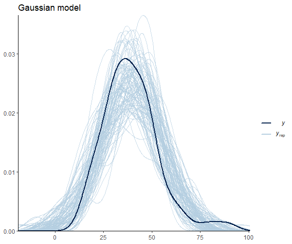
Figure 3 suggests that our observations (dark blue) are not meaningfully different from the model predictions. Below, I leave you with additional code to check other pp_check alternatives with their respective graphs.
set.seed(88071)

pp_check(Gaussian_Fit1, group = "Genotype", type = "dens_overlay_grouped", ndraws = 100) +
  labs(title = "Density by Genotype") +
    theme_classic()

pp_check(Gaussian_Fit1, type = "stat_grouped", group = "Genotype", stat = "var", binwidth = 3) +
  coord_cartesian(xlim = c(0, 300)) +
  ggtitle("Grouped variance") +
  theme_classic()

pp_check(Gaussian_Fit1, type = "stat", stat = "var", binwidth = 3) +
  coord_cartesian(xlim = c(0, 600)) +
  ggtitle("How well we captured the variace") +
  theme_classic()

pp_check(Gaussian_Fit1, type = "stat", stat = "mean", binwidth = 2) +
  coord_cartesian(xlim = c(0, 50)) +
  ggtitle("How well we captured the mean") +
  theme_classic()
Checking the results for the Gaussian distribution
Now, we use the describe_posterior function from the bayestestR package (4) to see the results:
describe_posterior(Gaussian_Fit1,
                   centrality = "mean",
                   dispersion = TRUE,
                   ci_method = "HDI",
                   test = "rope",
                   )

Let’s focus here on the ‘intercept’, which is the value for WT at 1 DPI, and ‘GenotypeKO’, the estimated difference for KO animals at the same time point. We see that WT animals spend about 37 seconds in the rotarod, while their KO counterparts spend less than a second (0.54) more. As a researcher in this field, I can say that this difference is meaningless and that genotype has no effect on rotarod performance. Even the effect of day, which is 2.9, seems meaningless to me under this model. We can easily visualize these estimates using the wonderful conditional_effects function from brms.
# We create the graph for convex hull
Gaussian_CondEffects <-
  conditional_effects(Gaussian_Fit1)

Gaussian_CondEffects <- plot(Gaussian_CondEffects,
       plot = FALSE)[[3]]

Gaussian_CondEffects +
  geom_point(data=data, aes(x = Day, y = Trial3, color = Genotype), inherit.aes=FALSE) +
  Plot_theme +
  theme(legend.position = "bottom", legend.direction = "horizontal")
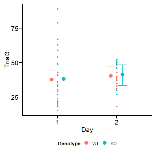
In Figure 8 we can see the estimates and uncertainty for the interaction terms. I have customized the plot with a number of ggplot elements, which you can check in the original Quarto Notebook. Note the similar uncertainty for both time points, even though the dispersion is larger on day 1 than on day 2. We will address this point in a small snippet at the end of this article.
Now let’s see how much our understanding changes when we model the same data using a student-t distribution.
Fitting our guest: a model with a student-t distribution
It’s time to use the student-t distribution in our `brms` model.
Student_Fit <- brm(Trial3 ~ Day * Genotype,
           data = data,
           family = student,
           # seed for reproducibility purposes
           seed = 8807,
           control = list(adapt_delta = 0.99),
           # this is to save the model in my laptop
           file    = "Models/20240222_OutliersStudent-t/Student_Fit.rds",
           file_refit = "never")

# Add loo for model comparison
Student_Fit <-
  add_criterion(Student_Fit, c("loo", "waic", "bayes_R2"))
Model diagnostics
We plot the model diagnostics as done before:
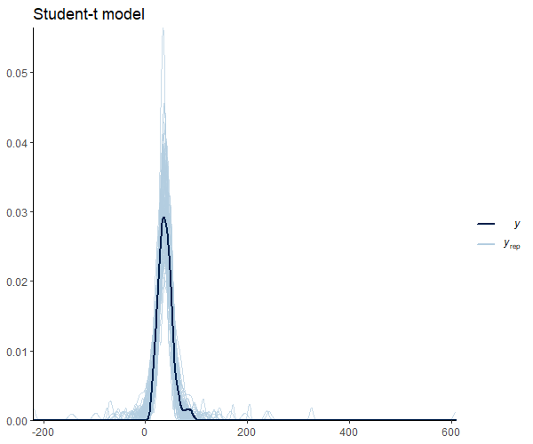
Figure 9 shows that the mean shape and the peak of the observations and the predictions match. It’s important to note that our model seems to predict values below 0. This is an important research issue that we will skip for now. However, it does imply the use of informative priors or distribution families that set a lower bound at 0, such as the log_normal’,hurdle_lognormal’, or `zero_inflated_poisson’, depending on the case. Andrew Heiss (5) offers a great example in this regard.
Checking the results for the student-t distribution
Let’s take a look at the posterior distribution:
describe_posterior(Student_Fit,
                   centrality = "mean",
                   dispersion = TRUE,
                   ci_method = "HDI",
                   test = "rope",
                   )

Under this model, we can see that our estimates have changed moderately, I would say. Our estimate for the intercept (WT at 1 day) is reduced by 7 seconds. And why is that? Because the extreme values we discovered at the beginning have less influence on the measures of central tendency of the data. Thus, this is a more accurate measure of the “typical” WT animal on day 1. We also observe a substantial increase in the effect of day, with almost 10 seconds more than our initial Gaussian estimates. Importantly, the effect of our KO genotype appears to be more notorious, increasing about 10 times from 0.52 in our Gaussian model to 5.5 in our student-t model. From my perspective, given the context of these data, the contrasts between the two models are notorious.
Let’s see it in graphical terms using conditional_effects:
Student_CondEffects <-
  conditional_effects(Student_Fit)

Student_CondEffects <- plot(Student_CondEffects,
       plot = FALSE)[[3]]

Student_CondEffects +
  geom_point(data=data, aes(x = Day, y = Trial3, color = Genotype), inherit.aes=FALSE) +
  Plot_theme +
  theme(legend.position = "bottom", legend.direction = "horizontal")
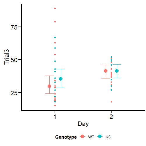
Can we get better estimates? For this particular example, I think we can. From the start, it was easy to notice the difference in the variance of the data, especially when we compare the first and second-day visuals. We improved our estimates using the student-t distribution, and we can improve them further by developing a model for heteroscedasticity that predicts sigma (the residual variance).
In this way, the model does not assume that your residual variance is equal across your grouping variables, but it becomes a response that can be modeled by predictors.
This is the little point we left for the end.
Predicting sigma using a student-t distribution
We include sigma as a response variable using thebf function from brms. In this case, we are going to model this parameter using the same predictors Day and Genotype.
Student_Mdl2 <- bf (Trial3 ~ Day * Genotype,
                     sigma ~ Day * Genotype)

Student_Fit2 <- brm(
           formula = Student_Mdl2,
           data = data,
           family = student,
           # seed for reproducibility purposes
           seed = 8807,
           control = list(adapt_delta = 0.99),
           # this is to save the model in my laptop
           file    = "Models/20240222_OutliersStudent-t/Student_Fit2.rds",
           file_refit = "never")

# Add loo for model comparison
Student_Fit2 <-
  add_criterion(Student_Fit2, c("loo", "waic", "bayes_R2"))
Model diagnostics
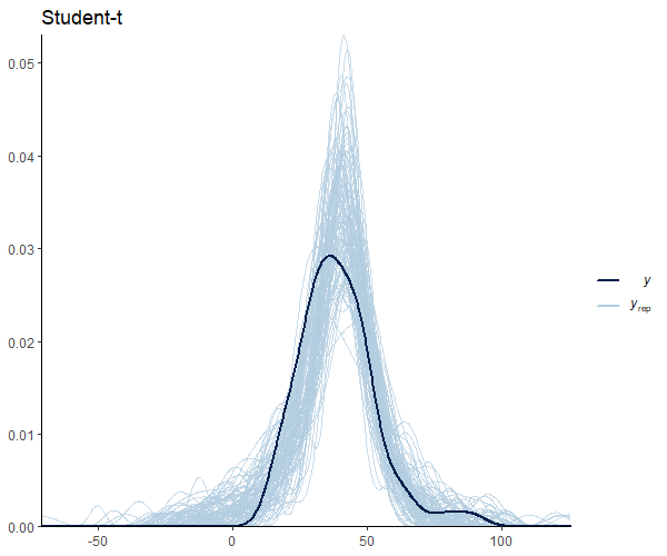
Figure 11 looks good, except for the uncomfortable predictions below 0. For this case, I judge that this does not strongly bias the estimates and their uncertainty. However, this is an aspect I will take into account when doing actual research.
Checking the results for the student-t distribution with predicted sigma
Now, let’s take a look at the posterior distribution.
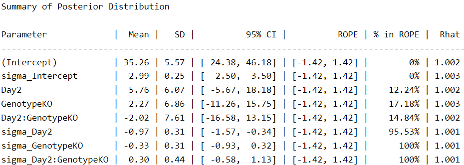
We see more parameters compared to the other two fitted models because the response for sigma is now included as a main effect in the model. Under this scheme, we see that the intercepts are closer to those of the Gaussian model and the effect of genotype (GenotypeKO) is reduced by half.
There is one aspect to note, however. In our first Student-t model, the uncertainty for the intercept was 24.1–37.4. On the other hand, in the last model, the uncertainty increases to 24.3–46.1. This means that when we consider the different variances, we are less certain of this (and other) parameters. The same is true for day, for example, which changes from 1.2–18.9 to -5.6–18.1. In this case, we are now less certain that the second day is associated with an increase in time spent on the rotarod.
Don’t worry, the purpose of statistical modeling is to provide the best possible quantification of the uncertainty in a measurement, and that’s what we’re doing right now. Of course, our uncertainty increases when we have extreme values that are part of our sample and therefore part of our population.
In this example, we see that accounting for the different variances in our data gives us a very different idea of our results.
Finally, we can see that sigma, plotted on the log scale, varies meaningfully with day and genotype:
Student_CondEffects2 <-
  conditional_effects(Student_Fit2)

Student_CondEffects2 <- plot(Student_CondEffects2,
       plot = FALSE)[[3]]

Student_CondEffects2 +
  geom_point(data=data, aes(x = Day, y = Trial3, color = Genotype), inherit.aes=FALSE) +
  Plot_theme +
  theme(legend.position = "bottom", legend.direction = "horizontal")


Student_CondEffects3 <-
  conditional_effects(Student_Fit2, dpar = "sigma")

Student_CondEffects3 <- plot(Student_CondEffects3,
       plot = FALSE)[[3]]

Student_CondEffects3 +
  Plot_theme +
  theme(legend.position = "bottom", legend.direction = "horizontal")
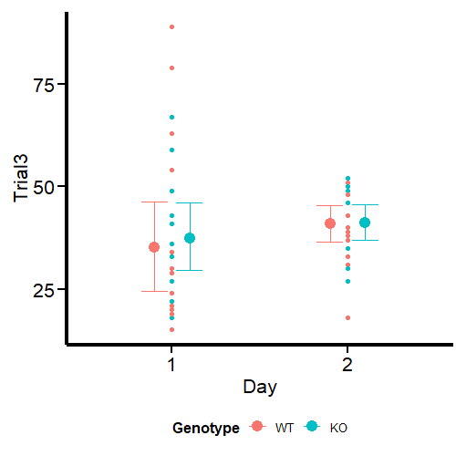
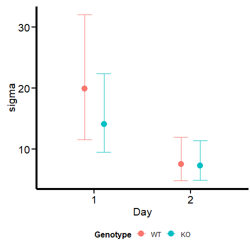
What we see in the second graph is sigma, which effectively accounts for the variance in this parameter between days and genotypes. We see a much higher uncertainty at day 1, especially for WT mice, while the parameter is analogous at day 2.
We can conclude this article by comparing the three models for out-of-sample predictions.
Model comparison
We perform model comparisons using the WAIC criteria (6)for estimating the out-of-sample prediction error. By considering both the log-likelihood of the observed data and the effective number of parameters, it provides a balance between model fit and complexity. Unlike some other criteria, WAIC inherently accounts for the posterior distribution of the parameters rather than relying on point estimates, making it particularly suited to Bayesian analyses.
Given a data set and a Bayesian model, the WAIC is calculated as:
WAIC=−2×(LLPD−pWAIC)
Where: LLPD is the log pointwise predictive density, calculated as the average log-likelihood for each observed data point across the posterior samples. WAIC is the effective number of parameters, computed as the difference between the average of the log-likelihoods and the log-likelihood of the averages across posterior samples.
We use the compare_performance function from the performance package, part of the easystats environment (4, 7, 8).
Fit_Comp <-
  compare_performance(
    Gaussian_Fit1,
    Student_Fit,
    Student_Fit2,
    metrics = "all")

Fit_Comp
The output shows that our Student-t model predicting sigma is the least penalized (WAIC = 497) for out-of-sample prediction. Note that there is no estimate for sigma in this model because it was included as a response variable. This table also shows that the student-t model has less residual variance (sigma) than the Gaussian model, which means that the variance is better explained by the predictors. We can visualize the same results as a graph:
Fit_Comp_W <-
loo_compare(
 Gaussian_Fit1,
    Student_Fit,
    Student_Fit2,
  criterion = "waic")

# Generate WAIC graph
Fit_Comp_WAIC <-
  Fit_Comp_W[, 7:8] %>%
  data.frame() %>%
  rownames_to_column(var = "model_name") %>%

ggplot(
  aes(x    = model_name,
      y    = waic,
      ymin = waic - se_waic,
      ymax = waic + se_waic)
  ) +
  geom_pointrange(shape = 21) +
  scale_x_discrete(
    breaks=c("Gaussian_Fit1",
             "Student_Fit",
             "Student_Fit2"),

    labels=c("Gaussian_Fit1",
             "Student_Fit",
             "Student_Fit2")

    ) +
  coord_flip() +
  labs(x = "",
       y = "WAIC (score)",
       title = "") +
  Plot_theme

Fit_Comp_WAIC
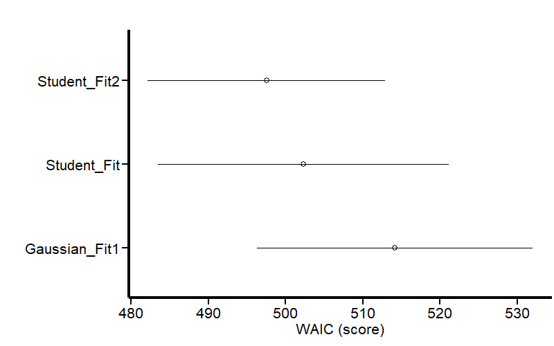
Figure 14 shows that our last model is less penalized for out-of-sample prediction.
You can find an updated version of this post on my GitHub site. Let me know if this journey was useful to you, and if you have any constructive comments to add to this exercise.
*Unless otherwise noted, all images are generated by the author using R code.
References
1.M. Ahsanullah, B. M. G. Kibria, M. Shakil, Normal and student´s t distributions and their applications (Atlantis Press, 2014; http://dx.doi.org/10.2991/978-94-6239-061-4).
2. P.-C. Bürkner, Brms: An r package for bayesian multilevel models using stan. 80 (2017), doi:10.18637/jss.v080.i01.
3. K. Yang, J. Tu, T. Chen, Homoscedasticity: an overlooked critical assumption for linear regression. General Psychiatry. 32, e100148 (2019).
4. D. Makowski, M. S. Ben-Shachar, D. Lüdecke, bayestestR: Describing effects and their uncertainty, existence and significance within the bayesian framework. 4, 1541 (2019).
5. A. Heiss, A guide to modeling proportions with bayesian beta and zero-inflated beta regression models (2021), (available at http://dx.doi.org/10.59350/7p1a4-0tw75).
6. A. Gelman, J. Hwang, A. Vehtari, Understanding predictive information criteria for Bayesian models. Statistics and Computing. 24, 997–1016 (2013).
7. D. Lüdecke, M. S. Ben-Shachar, I. Patil, P. Waggoner, D. Makowski, Performance: An r package for assessment, comparison and testing of statistical models. 6, 3139 (2021).
8. D. Makowski, M. Ben-Shachar, D. Lüdecke, bayestestR: Describing effects and their uncertainty, existence and significance within the bayesian framework. Journal of Open Source Software. 4, 1541 (2019).
Do not over-think about ‘outliers’, use a student-t distribution instead was originally published in Towards Data Science on Medium, where people are continuing the conversation by highlighting and responding to this story.
Originally appeared here:
Do not over-think about ‘outliers’, use a student-t distribution instead
Go Here to Read this Fast! Do not over-think about ‘outliers’, use a student-t distribution instead
