Chainlink (LINK) price has stagnated since breaking above the $20 mark on Feb. 10, as on-chain data trends suggest that whale investors booking profits could trigger a pullback.
The Korea Financial Intelligence Unit (KoFIU) announced a sweeping plan to enhance supervision of the crypto industry, which includes expelling crypto exchanges that fail to meet stringent operational standards, according to local media reports on Feb. 12. The initiative is part of South Korea’s effort to bolster financial oversight and consumer protection in the fast-evolving […]
Today, we will be discussing KL divergence, a very popular metric used in data science to measure the difference between two distributions. But before delving into the technicalities, let’s address a common barrier to understanding math and statistics.
Often, the challenge lies in the approach. Many perceive these subjects as a collection of formulas presented as divine truths, leaving learners struggling to interpret their meanings. Take the KL Divergence formula, for instance — it can seem intimidating at first glance, leading to frustration and a sense of defeat. However, this isn’t how mathematics evolved in the real world. Every formula we encounter is a product of human ingenuity, crafted to solve specific problems.
In this article, we’ll adopt a different perspective, treating math as a creative process. Instead of starting with formulas, we’ll begin with problems, asking: “What problem do we need to solve, and how can we develop a metric to address it?” This shift in approach can offer a more intuitive understanding of concepts like KL Divergence.
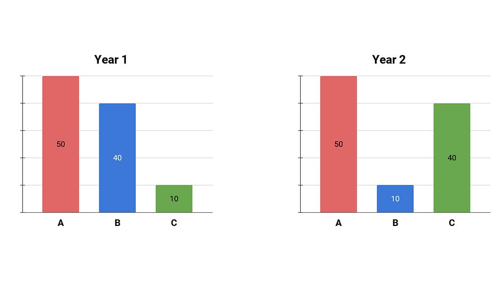
Enough theory — let’s tackle KL Divergence head-on. Imagine you’re a kindergarten teacher, annually surveying students about their favorite fruit, they can choose either apple, banana, or cantaloupe. You poll all of your students in your class year after year, you get the percentages and you draw them on these plots.
Consider two consecutive years: in year one, 50% preferred apples, 40% favored bananas, and 10% chose cantaloupe. In year two, the apple preference remained at 50%, but the distribution shifted — now, 10% preferred bananas, and 40% favored cantaloupe. The question we want to answer is: how different is the distribution in year two compared to year one?
Even before diving into math, we recognize a crucial criterion for our metric. Since we seek to measure the disparity between the two distributions, our metric (which we’ll later define as KL Divergence) must be asymmetric. In other words, swapping the distributions should yield different results, reflecting the distinct reference points in each scenario.
Now let’s get into this construction process. If we were tasked with devising this metric, how would we begin? One approach would be to focus on the elements — let’s call them A, B, and C — within each distribution and measure the ratio between their probabilities across the two years. In this discussion, we’ll denote the distributions as P and Q, with Q representing the reference distribution (year one).
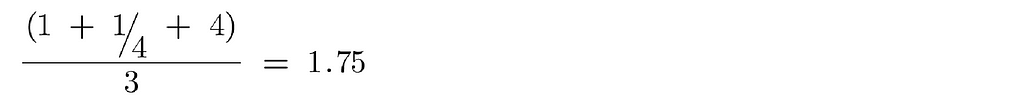
For instance, P(a) represents the proportion of year two students who liked apples (50%), and Q(a) represents the proportion of year one students with the same preference (also 50%). When we divide these values, we obtain 1, indicating no change in the proportion of apple preferences from year to year. Similarly, we calculate P(b)/Q(b) = 1/4, signifying a decrease in banana preferences, and P(c)/Q(c) = 4, indicating a fourfold increase in cantaloupe preferences from year one to year two.
That’s a good first step. In the interest of just keeping things simple in mathematics, what if we averaged these three ratios? Each ratio reflects a change between elements in our distributions. By adding them and dividing by three, we arrive at a preliminary metric:
This metric provides an indication of the difference between the two distributions. However, let’s address a flaw introduced by this method. We know that averages can be skewed by large numbers. In our case, the ratios ¼ and 4 represent opposing yet equal influences. However, when averaged, the influence of 4 dominates, potentially inflating our metric. Thus, a simple average might not be the ideal solution.
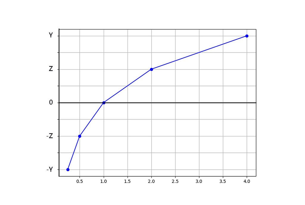
To rectify this, let’s explore a transformation. Can we find a function, denoted as F, to apply to these ratios (1, ¼, 4) that satisfies the requirement of treating opposing influences equally? We seek a function where, if we input 4, we obtain a certain value (y), and if we input 1/4, we get (-y). To know this function we’re simply going to map values of the function and we’ll see what kind of function we know about could fit that shape.
Suppose F(4) = y and F(¼) = -y. This property isn’t unique to the numbers 4 and ¼; it holds for any pair of reciprocal numbers. For instance, if F(2) = z, then F(½) = -z. Adding another point, F(1) = F(1/1) = x, we find that x should equal 0.
Plotting these points, we observe a distinctive pattern emerge:
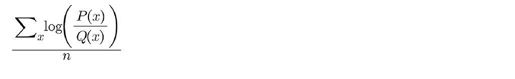
I’m sure many of us would agree that the general shape resembles a logarithmic curve, suggesting that we can use log(x) as our function F. Instead of simply calculating P(x)/Q(x), we’ll apply a log transformation, resulting in log(P(x)/Q(x)). This transformation helps eliminate the issue of large numbers skewing averages. If we sum the log transformations for the three fruits and take the average, it would look like this:
What if this was our metric, is there any issue with that?
One possible concern is that we want our metric to prioritize popular x values in our current distribution. In simpler terms, if in year two, 50 students like apples, 10 like bananas, and 40 like cantaloupe, we should weigh changes in apples and cantaloupe more heavily than changes in bananas because only 10 students care about them, therefore it won’t affect the current population anyway.
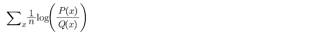
Currently, the weight we’re assigning to each change is 1/n, where n represents the total number of elements.
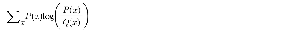
Instead of this equal weighting, let’s use a probabilistic weighting based on the proportion of students that like a particular fruit in the current distribution, denoted by P(x).
The only change I have made is replaced the equal weighting on each of these items we care about with a probabilistic weighting where we care about it as much as its frequency in the current distribution, things that are very popular get a lot of priority, things that are not popular right now (even if they were popular in the past distribution) do not contribute as much to this KL Divergence.
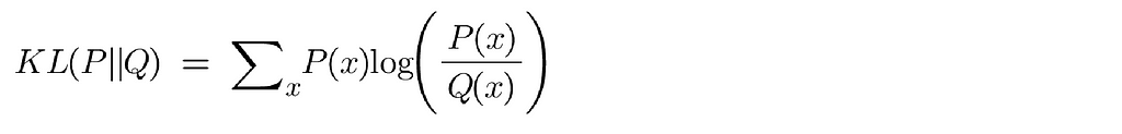
This formula represents the accepted definition of the KL Divergence. The notation often appears as KL(P||Q), indicating how much P has changed relative to Q.
Now remember we wanted our metric to be asymmetric. Did we satisfy that? Switching P and Q in the formula yields different results, aligning with our requirement for an asymmetric metric.
Summary
Firstly I do hope you understand the KL Divergence here but more importantly I hope it wasn’t as scary as if we started from the formula on the very first and then we tried our best to kind of understand why it looked the way it does.
Other things I would say here is that this is the discrete form of the KL Divergence, suitable for discrete categories like the ones we’ve discussed. For continuous distributions, the principle remains the same, except we replace the sum with an integral (∫).
NOTE: Unless otherwise noted, all images are by the author.
This post is co-written with Kostia Kofman and Jenny Tokar from Booking.com. As a global leader in the online travel industry, Booking.com is always seeking innovative ways to enhance its services and provide customers with tailored and seamless experiences. The Ranking team at Booking.com plays a pivotal role in ensuring that the search and recommendation […]
Developers have begun offering insight into how their apps are performing on the Apple Vision Pro, with many developers feeling underwhelmed right now.
Apple’s visionOS menu system
Currently, the Apple Vision Pro has a library of about 600 apps, but it remains to be seen if any are considered the killer app yet. The $3,500 barrier to entry, coupled with units still shipping out to developers, means that any insights that can be gleaned just yet may not hold true over the next several months.
However, it’s worth looking at what’s worked and what hasn’t. Tom Ffiske, of Immersive Wirereached out to developers to see why some apps are doing well and others are not.
Don’t read too much into early Apple Vision Pro app sales
Originally appeared here:
Don’t read too much into early Apple Vision Pro app sales
We use cookies on our website to give you the most relevant experience by remembering your preferences and repeat visits. By clicking “Accept”, you consent to the use of ALL the cookies.
This website uses cookies to improve your experience while you navigate through the website. Out of these, the cookies that are categorized as necessary are stored on your browser as they are essential for the working of basic functionalities of the website. We also use third-party cookies that help us analyze and understand how you use this website. These cookies will be stored in your browser only with your consent. You also have the option to opt-out of these cookies. But opting out of some of these cookies may affect your browsing experience.
Necessary cookies are absolutely essential for the website to function properly. These cookies ensure basic functionalities and security features of the website, anonymously.
Cookie
Duration
Description
cookielawinfo-checkbox-analytics
11 months
This cookie is set by GDPR Cookie Consent plugin. The cookie is used to store the user consent for the cookies in the category "Analytics".
cookielawinfo-checkbox-functional
11 months
The cookie is set by GDPR cookie consent to record the user consent for the cookies in the category "Functional".
cookielawinfo-checkbox-necessary
11 months
This cookie is set by GDPR Cookie Consent plugin. The cookies is used to store the user consent for the cookies in the category "Necessary".
cookielawinfo-checkbox-others
11 months
This cookie is set by GDPR Cookie Consent plugin. The cookie is used to store the user consent for the cookies in the category "Other.
cookielawinfo-checkbox-performance
11 months
This cookie is set by GDPR Cookie Consent plugin. The cookie is used to store the user consent for the cookies in the category "Performance".
viewed_cookie_policy
11 months
The cookie is set by the GDPR Cookie Consent plugin and is used to store whether or not user has consented to the use of cookies. It does not store any personal data.
Functional cookies help to perform certain functionalities like sharing the content of the website on social media platforms, collect feedbacks, and other third-party features.
Performance cookies are used to understand and analyze the key performance indexes of the website which helps in delivering a better user experience for the visitors.
Analytical cookies are used to understand how visitors interact with the website. These cookies help provide information on metrics the number of visitors, bounce rate, traffic source, etc.
Advertisement cookies are used to provide visitors with relevant ads and marketing campaigns. These cookies track visitors across websites and collect information to provide customized ads.