Leading Web3 social infrastructure platform UXLINK announced it has set new records in user engagement and asset deposits during its recent launch campaign. The platform functions as a decentralized real-world social protocol. It has been instrumental in empowering decentralized applications (DApps) to leverage a wide array of social resources, both on-chain and off-chain. UXLINK aims […]
Gauntlet terminates 4-year partnership with Aave due to DAO governance challenges. Gauntlet was Aave’s Risk Steward. Aave now faces the task of finding a new Risk Steward after Gauntlet withdraws. In an announcement made by Gauntlet co-founder John Morrow in an Aave forum post, Gauntlet, a prominent blockchain risk management firm, has terminated its four-year […]
While a possible spot Ethereum ETF approval looms ahead, Grayscale experts believe an upcoming technological improvement is behind recent price upticks.
CoinMarketCap has announced the launch of the inaugural CMC Crypto Awards to recognize the accomplishments of networks, people, and technology in the crypto industry. The awards are scheduled to take place between Feb. 21 and March 6. The selection of winners will rely on CoinMarketCap data, insights from expert panels, and community votes, with the […]
Since Tyler Vigen coined the term ‘spurious correlations’ for “any random correlations dredged up from silly data” (Vigen, 2014) see: Tyler Vigen’s personal website, there have been many articles that pay tribute to the perils and pitfalls of this whimsical tendency to manipulate statistics to make correlation equal causation. See: HBR (2015), Medium (2016), FiveThirtyEight (2016). As data scientists, we are tasked with providing statistical analyses that either accept or reject null hypotheses. We are taught to be ethical in how we source data, extract it, preprocess it, and make statistical assumptions about it. And this is no small matter — global companies rely on the validity and accuracy of our analyses. It is just as important that our work be reproducible. Yet, in spite of all of the ‘good’ that we are taught to practice, there may be that one occasion (or more) where a boss or client will insist that you work the data until it supports the hypothesis and, above all, show how variable y causes variable x when correlated. This is the basis of p-hacking where you enter into a territory that is far from supported by ‘good’ practice. In this report, we learn how to conduct fallacious research using spurious correlations. We get to delve into ‘bad’ with the objective of learning what not to do when you are faced with that inevitable moment to deliver what the boss or client whispers in your ear.
The objective of this project is to teach you
what not to do with statistics
We’ll demonstrate the spurious correlation of two unrelated variables. Datasets from two different sources were preprocessed and merged together in order to produce visuals of relationships. Spurious correlations occur when two variables are misleadingly correlated, and it is further assumed that one variable directly affects the other variable so as to cause a certain outcome. The reason we chose this project idea is because we were interested in ways that manage a client’s expectations of what a data analysis project should produce. For team member Banks, sometimes she has had clients demonstrate displeasure with analysis results and actually on one occasion she was asked to go back and look at other data sources and opportunities to “help” arrive at the answers they were seeking. Yes, this is p-hacking — in this case, where the client insisted that causal relationships existed because they believe the correlations existed to cause an outcome.
Examples of Spurious Correlations
Excerpts of Tyler Vigen’s Spurious Correlations. Retrieved February 1, 2024, from Spurious Correlations (tylervigen.com) Reprinted with permission from the author.
Research Questions Pertinent to this Study
What are the research questions?
Why the heck do we need them?
We’re doing a “bad” analysis, right?
Research questions are the foundation of the research study. They guide the research process by focusing on specific topics that the researcher will investigate. Reasons why they are essential include but are not limited to: for focus and clarity; as guidance for methodology; establish the relevance of the study; help to structure the report; help the researcher evaluate results and interpret findings. In learning how a ‘bad’ analysis is conducted, we addressed the following questions:
(1) Are the data sources valid (not made up)?
(2) How were missing values handled?
(3) How were you able to merge dissimilar datasets?
(4) What are the response and predictor variables?
(5) Is the relationship between the response and predictor variables linear?
(6) Is there a correlation between the response and predictor variables?
(7) Can we say that there is a causal relationship between the variables?
(8) What explanation would you provide a client interested in the relationship between these two variables?
(9) Did you find spurious correlations in the chosen datasets?
(10) What learning was your takeaway in conducting this project?
Methodology
How did we conduct a study about
Spurious Correlations?
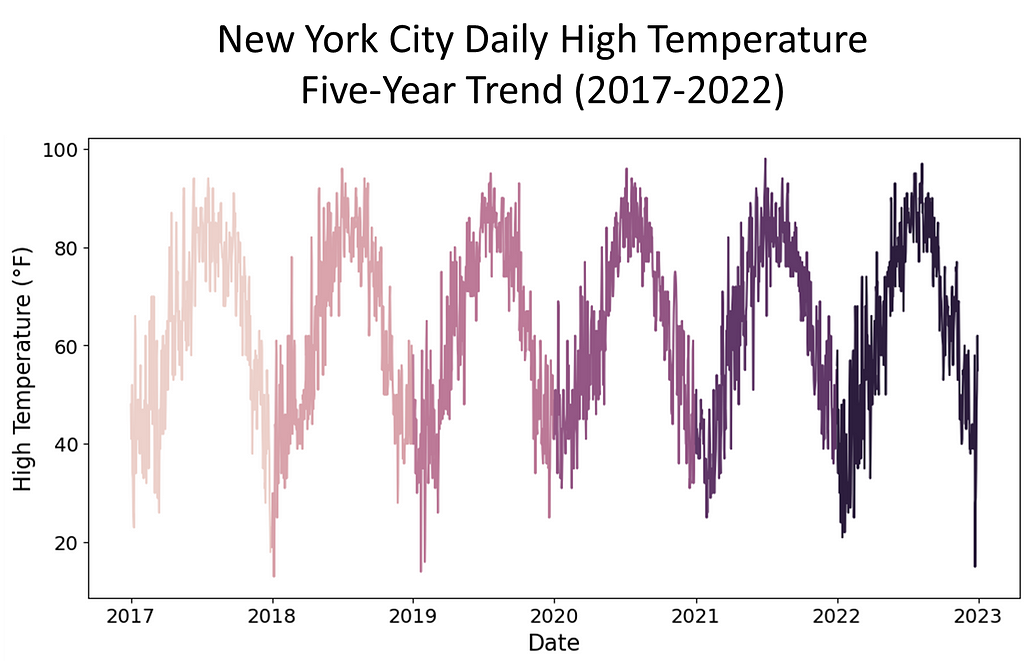
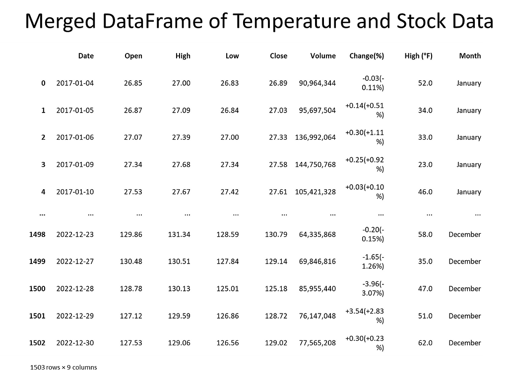
To investigate the presence of spurious correlations between variables, a comprehensive analysis was conducted. The datasets spanned different domains of economic and environmental factors that were collected and affirmed as being from public sources. The datasets contained variables with no apparent causal relationship but exhibited statistical correlation. The chosen datasets were of the Apple stock data, the primary, and daily high temperatures in New York City, the secondary. The datasets spanned the time period of January, 2017 through December, 2022.
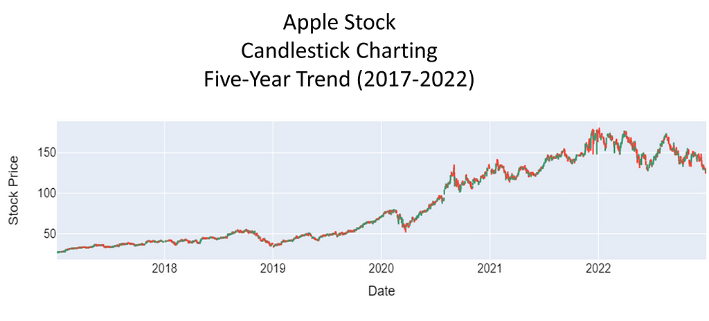
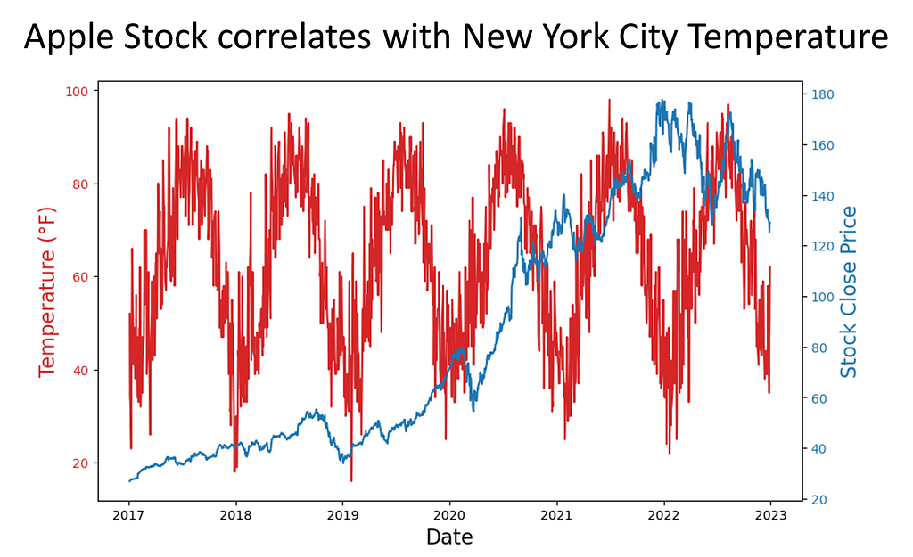
Rigorous statistical techniques were used to analyze the data. A Pearson correlation coefficients was calculated to quantify the strength and direction of linear relationships between pairs of the variables. To complete this analysis, scatter plots of the 5-year daily high temperatures in New York City, candlestick charting of the 5-year Apple stock trend, and a dual-axis charting of the daily high temperatures versus sock trend were utilized to visualize the relationship between variables and to identify patterns or trends. Areas this methodology followed were:
The data was affirmed as publicly sourced and available for reproducibility. Capturing the data over a time period of five years gave a meaningful view of patterns, trends, and linearity. Temperature readings saw seasonal trends. For temperature and stock, there were troughs and peaks in data points. Note temperature was in Fahrenheit, a meteorological setting. We used astronomical setting to further manipulate our data to pose stronger spuriousness. While the data could be downloaded as csv or xls files, for this assignment, Python’s Beautiful soup web scraping API was used.
Next, the data was checked for missing values and how many records each contained. Weather data contained date, daily high, daily low temperature, and Apple stock data contained date, opening price, closing price, volume, stock price, stock name. To merge the datasets, the date columns needed to be in datetime format. An inner join matched records and discarded non-matching. For Apple stock, date and daily closing price represented the columns of interest. For the weather, date and daily high temperature represented the columns of interest.
The Data: Manipulation
From Duarte® Slide Deck
To do ‘bad’ the right way, you have to
massage the data until you find the
relationship that you’re looking for…
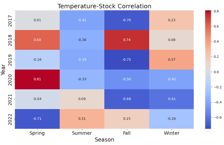
Our earlier approach did not quite yield the intended results. So, instead of using the summer season of 2018 temperatures in five U.S. cities, we pulled five years of daily high temperatures for New York City and Apple Stock performance from January, 2017 through December, 2022. In conducting exploratory analysis, we saw weak correlations across the seasons and years. So, our next step was to convert the temperature. Instead of meteorological, we chose astronomical. This gave us ‘meaningful’ correlations across seasons.
With the new approach in place, we noticed that merging the datasets was problematic. The date fields were different where for weather, the date was month and day. For stock, the date was in year-month-day format. We addressed this by converting each dataset’s date column to datetime. Also, each date column was sorted either in chronological or reverse chronological order. This was resolved by sorting both date columns in ascending order.
Analysis I: Do We Have Spurious Correlation? Can We Prove It?
The spurious nature of the correlations
here is shown by shifting from
meteorological seasons (Spring: Mar-May,
Summer: Jun-Aug, Fall: Sep-Nov, Winter:
Dec-Feb) which are based on weather
patterns in the northern hemisphere, to
astronomical seasons (Spring: Apr-Jun,
Summer: Jul-Sep, Fall: Oct-Dec, Winter:
Jan-Mar) which are based on Earth’s tilt.
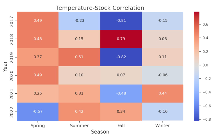
Once we accomplished the exploration, a key point in our analysis of spurious correlation was to determine if the variables of interest correlate. We eyeballed that Spring 2020 had a correlation of 0.81. We then determined if there was statistical significance — yes, and at p-value ≈ 0.000000000000001066818316115281, I’d say we have significance!
Spring 2020 temperatures correlate with Apple stock
Analysis II: Additional Statistics to Test the Nature of Spuriousness
If there is truly spurious correlation, we may want to
consider if the correlation equates to causation — that
is, does a change in astronomical temperature cause
Apple stock to fluctuate? We employed further
statistical testing to prove or reject the hypothesis
that one variable causes the other variable.
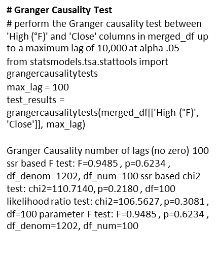
There are numerous statistical tools that test for causality. Tools such as Instrumental Variable (IV) Analysis, Panel Data Analysis, Structural Equation Modelling (SEM), Vector Autoregression Models, Cointegration Analysis, and Granger Causality. IV analysis considers omitted variables in regression analysis; Panel Data studies fixed-effects and random effects models; SEM analyzes structural relationships; Vector Autoregression considers dynamic multivariate time series interactions; and Cointegration Analysis determines whether variables move together in a stochastic trend. We wanted a tool that could finely distinguish between genuine causality and coincidental association. To achieve this, our choice was Granger Causality.
Granger Causality
A Granger test checks whether past values can predict future ones. In our case, we tested whether past daily high temperatures in New York City could predict future values of Apple stock prices.
Ho: Daily high temperatures in New York City do not Granger cause Apple stock price fluctuation.
To conduct the test, we ran through 100 lags to see if there was a standout p-value. We encountered near 1.0 p-values, and this suggested that we could not reject the null hypothesis, and we concluded that there was no evidence of a causal relationship between the variables of interest.
Granger Causality Test at lags=100
Analysis III: Statistics to Validate Not Rejecting the Null Ho
Granger causality proved the p-value
insignificant in rejecting the null
hypothesis. But, is that enough?
Let’s validate our analysis.
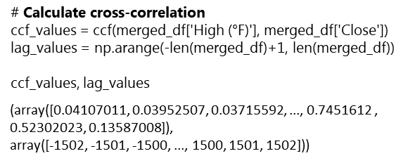
To help in mitigating the risk of misinterpreting spuriousness as genuine causal effects, performing a Cross-Correlation analysis in conjunction with a Granger causality test will confirm its finding. Using this approach, if spurious correlation exists, we will observe significance in cross-correlation at some lags without consistent causal direction or without Granger causality being present.
Cross-Correlation Analysis
This method is accomplished by the following steps:
Examine temporal patterns of correlations between variables;
•If variable A Granger causes variable B, significant cross-correlation will occur between variable A and variable B at positive lags;
Significant peaks in cross-correlation at specific lags infers the time delay between changes in the causal variable.
Interpretation:
The ccf and lag values show significance in positive correlation at certain lags. This confirms that spurious correlation exists. However, like the Granger causality, the cross-correlation analysis cannot support the claim that causality exists in the relationship between the two variables.
Wrapup: Key Learnings
Spurious correlations are a form of p-hacking. Correlation does not imply causation.
Even with ‘bad’ data tactics, statistical testing will root out the lack of significance. While there was statistical evidence of spuriousness in the variables, causality testing could not support the claim that causality existed in the relationship of the variables.
A study cannot rest on the sole premise that variables displaying linearity can be correlated to exhibit causality. Instead, other factors that contribute to each variable must be considered.
A non-statistical test of whether daily high temperatures in New York City cause Apple stock to fluctuate can be to just consider: If you owned an Apple stock certificate and you placed it in the freezer, would the value of the certificate be impacted by the cold? Similarly, if you placed the certificate outside on a sunny, hot day, would the sun impact the value of the certificate?
Ethical Considerations: P-Hacking is Not a Valid Analysis
This study portrayed analysis that involved ‘bad’ statistics. It demonstrated how a data scientist could source, extract and manipulate data in such a way as to statistically show correlation. In the end, statistical testing withstood the challenge and demonstrated that correlation does not equal causality.
Conducting a spurious correlation brings ethical questions of using statistics to derive causation in two unrelated variables. It is an example of p-hacking, which exploits statistics in order to achieve a desired outcome. This study was done as academic research to show the absurdity in misusing statistics.
Another area of ethical consideration is the practice of web scraping. Many website owners warn against pulling data from their sites to use in nefarious ways or ways unintended by them. For this reason, sites like Yahoo Finance make stock data downloadable to csv files. This is also true for most weather sites where you can request time datasets of temperature readings. Again, this study is for academic research and to demonstrate one’s ability to extract data in a nonconventional way.
When faced with a boss or client that compels you to p-hack and offer something like a spurious correlation as proof of causality, explain the implications of their ask and respectfully refuse the project. Whatever your decision, it will have a lasting impact on your credibility as a data scientist.
Dr. Banks is CEO of I-Meta, maker of the patented Spice Chip Technology that provides Big Data analytics for various industries. Mr. Boothroyd, III is a retired Military Analyst. Both are veterans having honorably served in the United States military and both enjoy discussing spurious correlations. They are cohorts of the University of Michigan, School of Information MADS program…Go Blue!
Financial Content Services, Inc. Apple Stock Price History | Historical AAPL Company Stock Prices | Financial Content Business Page. Retrieved January 24, 2024 from
Mr. Vigen’s graphs were reprinted with permission from the author received on January 31, 2024.
Images were licensed from their respective owners.
Code Section
##########################
# IMPORT LIBRARIES SECTION
##########################
# Import web scraping tool
import requests
from bs4 import BeautifulSoup
import pandas as pd
import numpy as np

# Import visualization appropriate libraries
import plotly.graph_objects as go
from plotly.subplots import make_subplots
import seaborn as sns # New York temperature plotting
import plotly.graph_objects as go # Apple stock charting
from pandas.plotting import scatter_matrix # scatterplot matrix

# Import appropriate libraries for New York temperature plotting
import seaborn as sns
import matplotlib.pyplot as plt
from datetime import datetime, timedelta
import re

# Convert day to datetime library
import calendar

# Cross-correlation analysis library
from statsmodels.tsa.stattools import ccf

# Stats library
import scipy.stats as stats

# Granger causality library
from statsmodels.tsa.stattools import grangercausalitytests
################################################################################## # EXAMINE THE NEW YORK CITY WEATHER AND APPLE STOCK DATA IN READYING FOR MERGE ... ##################################################################################
# Extract New York City weather data for the years 2017 to 2022 for all 12 months # 5-YEAR NEW YORK CITY TEMPERATURE DATA
# Function to convert 'Day' column to a consistent date format for merging def convert_nyc_date(day, month_name, year): month_num = datetime.strptime(month_name, '%B').month
# Extract numeric day using regular expression day_match = re.search(r'd+', day) day_value = int(day_match.group()) if day_match else 1
# Set variables years = range(2017, 2023) all_data = [] # Initialize an empty list to store data for all years
# Enter for loop for year in years: url = f'https://www.extremeweatherwatch.com/cities/new-york/year-{year}' response = requests.get(url) soup = BeautifulSoup(response.text, 'html.parser')
if table: data = [] for row in table.find_all('tr')[1:]: cols = row.find_all('td') day = cols[0].text.strip() high_temp = float(cols[1].text.strip()) data.append([convert_nyc_date(day, month_name, year), high_temp])
monthly_df = pd.DataFrame(data, columns=['Date', 'High (°F)']) monthly_data.append(monthly_df) else: print(f"Table not found for {month_name.capitalize()} {year}") else: print(f"h5 tag not found for {month_name.capitalize()} {year}")
# Concatenate monthly data to form the complete dataframe for the year yearly_nyc_df = pd.concat(monthly_data, ignore_index=True)
# Extract month name from the 'Date' column yearly_nyc_df['Month'] = yearly_nyc_df['Date'].dt.strftime('%B')
# Capitalize the month names yearly_nyc_df['Month'] = yearly_nyc_df['Month'].str.capitalize()
all_data.append(yearly_nyc_df)
###################################################################################################### # Generate a time series plot of the 5-year New York City daily high temperatures ######################################################################################################
# Concatenate the data for all years if all_data: combined_df = pd.concat(all_data, ignore_index=True)
# Create a line plot for each year plt.figure(figsize=(12, 6)) sns.lineplot(data=combined_df, x='Date', y='High (°F)', hue=combined_df['Date'].dt.year) plt.title('New York City Daily High Temperature Time Series (2017-2022) - 5-Year Trend', fontsize=18) plt.xlabel('Date', fontsize=16) # Set x-axis label plt.ylabel('High Temperature (°F)', fontsize=16) # Set y-axis label plt.legend(title='Year', bbox_to_anchor=(1.05, 1), loc='upper left', fontsize=14) # Display legend outside the plot plt.tick_params(axis='both', which='major', labelsize=14) # Set font size for both axes' ticks plt.show()
# APPLE STOCK CODE
# Set variables years = range(2017, 2023) data = [] # Initialize an empty list to store data for all years
# Extract Apple's historical data for the years 2017 to 2022 for year in years: url = f'https://markets.financialcontent.com/stocks/quote/historical?Symbol=537%3A908440&Year={year}&Month=12&Range=12' response = requests.get(url) soup = BeautifulSoup(response.text, 'html.parser') table = soup.find('table', {'class': 'quote_detailed_price_table'})
if table: for row in table.find_all('tr')[1:]: cols = row.find_all('td') date = cols[0].text
# Check if the year is within the desired range if str(year) in date: open_price = cols[1].text high = cols[2].text low = cols[3].text close = cols[4].text volume = cols[5].text change_percent = cols[6].text data.append([date, open_price, high, low, close, volume, change_percent])
# Create a DataFrame from the extracted data apple_df = pd.DataFrame(data, columns=['Date', 'Open', 'High', 'Low', 'Close', 'Volume', 'Change(%)'])
# Verify that DataFrame contains 5-years # apple_df.head(50)
################################################################# # Generate a Candlestick charting of the 5-year stock performance #################################################################
new_apple_df = apple_df.copy()
# Convert Apple 'Date' column to a consistent date format new_apple_df['Date'] = pd.to_datetime(new_apple_df['Date'], format='%b %d, %Y')
# Sort the datasets by 'Date' in ascending order new_apple_df = new_apple_df.sort_values('Date')
# Convert numerical columns to float, handling empty strings numeric_cols = ['Open', 'High', 'Low', 'Close', 'Volume', 'Change(%)'] for col in numeric_cols: new_apple_df[col] = pd.to_numeric(new_apple_df[col], errors='coerce')
##########################################
# MERGE THE NEW_NYC_DF WITH NEW_APPLE_DF
##########################################
# Convert the 'Day' column in New York City combined_df to a consistent date format ...

new_nyc_df = combined_df.copy()

# Add missing weekends to NYC temperature data
start_date = new_nyc_df['Date'].min()
end_date = new_nyc_df['Date'].max()
weekend_dates = pd.date_range(start_date, end_date, freq='B')  # B: business day frequency (excludes weekends)
missing_weekends = weekend_dates[~weekend_dates.isin(new_nyc_df['Date'])]
missing_data = pd.DataFrame({'Date': missing_weekends, 'High (°F)': None})
new_nyc_df = pd.concat([new_nyc_df, missing_data]).sort_values('Date').reset_index(drop=True)  # Resetting index
new_apple_df = apple_df.copy()

# Convert Apple 'Date' column to a consistent date format
new_apple_df['Date'] = pd.to_datetime(new_apple_df['Date'], format='%b %d, %Y')

# Sort the datasets by 'Date' in ascending order
new_nyc_df = combined_df.sort_values('Date')
new_apple_df = new_apple_df.sort_values('Date')

# Merge the datasets on the 'Date' column
merged_df = pd.merge(new_apple_df, new_nyc_df, on='Date', how='inner')

# Verify the correct merge -- should merge only NYC temp records that match with Apple stock records by Date
merged_df
# Ensure the columns of interest are numeric
merged_df['High (°F)'] = pd.to_numeric(merged_df['High (°F)'], errors='coerce')
merged_df['Close'] = pd.to_numeric(merged_df['Close'], errors='coerce')

# UPDATED CODE BY PAUL USES ASTRONOMICAL TEMPERATURES

# CORRELATION HEATMAP OF YEAR-OVER-YEAR
# DAILY HIGH NYC TEMPERATURES VS.
# APPLE STOCK 2017-2023

import pandas as pd
import numpy as np
import matplotlib.pyplot as plt
import seaborn as sns

# Convert 'Date' to datetime
merged_df['Date'] = pd.to_datetime(merged_df['Date'])

# Define a function to map months to seasons
def map_season(month):
    if month in [4, 5, 6]:
        return 'Spring'
    elif month in [7, 8, 9]:
        return 'Summer'
    elif month in [10, 11, 12]:
        return 'Fall'
    else:
        return 'Winter'

# Extract month from the Date column and map it to seasons
merged_df['Season'] = merged_df['Date'].dt.month.map(map_season)

# Extract the years present in the data
years = merged_df['Date'].dt.year.unique()

# Create subplots for each combination of year and season
seasons = ['Spring', 'Summer', 'Fall', 'Winter']

# Convert 'Close' column to numeric
merged_df['Close'] = pd.to_numeric(merged_df['Close'], errors='coerce')

# Create an empty DataFrame to store correlation matrix
corr_matrix = pd.DataFrame(index=years, columns=seasons)

# Calculate correlation matrix for each combination of year and season
for year in years:
    year_data = merged_df[merged_df['Date'].dt.year == year]
    for season in seasons:
        data = year_data[year_data['Season'] == season]
        corr = data['High (°F)'].corr(data['Close'])
        corr_matrix.loc[year, season] = corr

# Plot correlation matrix
plt.figure(figsize=(10, 6))
sns.heatmap(corr_matrix.astype(float), annot=True, cmap='coolwarm', fmt=".2f")
plt.title('Temperature-Stock Correlation', fontsize=18)  # Set main title font size
plt.xlabel('Season', fontsize=16)  # Set x-axis label font size
plt.ylabel('Year', fontsize=16)  # Set y-axis label font size
plt.tick_params(axis='both', which='major', labelsize=14)  # Set annotation font size
plt.tight_layout()
plt.show()
####################### # STAT ANALYSIS SECTION ####################### ############################################################# # GRANGER CAUSALITY TEST # test whether past values of temperature (or stock prices) # can predict future values of stock prices (or temperature). # perform the Granger causality test between 'High (°F)' and # 'Close' columns in merged_df up to a maximum lag of 255 #############################################################
# Perform Granger causality test max_lag = 1 # Choose the maximum lag of 100 - Jupyter times out at higher lags test_results = grangercausalitytests(merged_df[['High (°F)', 'Close']], max_lag)
# Interpretation:
# looks like none of the lag give a significant p-value # at alpha .05, we cannot reject the null hypothesis, that is, # we cannot conclude that Granger causality exists between daily high # temperatures in NYC and Apple stock
################################################################# # CROSS-CORRELATION ANALYSIS # calculate the cross-correlation between 'High (°F)' and 'Close' # columns in merged_df, and ccf_values will contain the # cross-correlation coefficients, while lag_values will # contain the corresponding lag values #################################################################
# Interpretation: # Looks like there is strong positive correlation in the variables # in latter years and positive correlation in their respective # lags. This confirms what our plotting shows us
######################################################## # LOOK AT THE BEST CORRELATION COEFFICIENT - 2020? LET'S # EXPLORE FURTHER AND CALCULATE THE p-VALUE AND # CONFIDENCE INTERVAL ########################################################
# Get dataframes for specific periods of spurious correlation
#####################################################################
# VISUALIZE RELATIONSHIP BETWEEN APPLE STOCK AND NYC DAILY HIGH TEMPS
#####################################################################

# Dual y-axis plotting using twinx() function from matplotlib
date = merged_df['Date']
temperature = merged_df['High (°F)']
stock_close = merged_df['Close']

# Create a figure and axis
fig, ax1 = plt.subplots(figsize=(10, 6))

# Plotting temperature on the left y-axis (ax1)
color = 'tab:red'
ax1.set_xlabel('Date', fontsize=16)
ax1.set_ylabel('Temperature (°F)', color=color, fontsize=16)
ax1.plot(date, temperature, color=color)
ax1.tick_params(axis='y', labelcolor=color)

# Create a secondary y-axis for the stock close prices
ax2 = ax1.twinx()
color = 'tab:blue'
ax2.set_ylabel('Stock Close Price', color=color, fontsize=16)
ax2.plot(date, stock_close, color=color)
ax2.tick_params(axis='y', labelcolor=color)

# Title and show the plot
plt.title('Apple Stock correlates with New York City Temperature', fontsize=18)
plt.show()
Research Review for Scene Text Editing: STEFANN, SRNet, TextDiffuser, AnyText and more.
If you ever tried to change the text in an image, you know it’s not trivial. Preserving the background, textures, and shadows takes a Photoshop license and hard-earned designer skills. In the video below, a Photoshop expert takes 13 minutes to fix a few misspelled characters in a poster that is not even stylistically complex. The good news is — in our relentless pursuit of AGI, humanity is also building AI models that are actually useful in real life. Like the ones that allow us to edit text in images with minimal effort.
The task of automatically updating the text in an image is formally known as Scene Text Editing (STE). This article describes how STE model architectures have evolved over time and the capabilities they have unlocked. We will also talk about their limitations and the work that remains to be done. Prior familiarity with GANs and Diffusion models will be helpful, but not strictly necessary.
Disclaimer: I am the cofounder of Storia AI, building an AI copilot for visual editing. This literature review was done as part of developing Textify, a feature that allows users to seamlessly change text in images. While Textify is closed-source, we open-sourced a related library, Detextify, which automatically removes text from a corpus of images.
Example of Scene Text Editing (STE). The original image (left) was generated via Midjourney. We used Textify to annotate the image (center) and automatically fix the misspelling (right).
The Task of Scene Text Editing (STE)
Definition
Scene Text Editing (STE) is the task of automatically modifying text in images that capture a visual scene (as opposed to images that mainly contain text, such as scanned documents). The goal is to change the text while preserving the original aesthetics (typography, calligraphy, background etc.) without the inevitably expensive human labor.
Use Cases
Scene Text Editing might seem like a contrived task, but it actually has multiple practical uses cases:
(1) Synthetic data generation for Scene Text Recognition (STR)
Synthetic image (right) obtained by editing text in the original image (left, from Unsplash). This technique can be used to augment the training set of STR (Scene Text Recognition) models.
When I started researching this task, I was surprised to discover that Alibaba (an e-commerce platform) and Baidu (a search engine) are consistently publishing research on STE.
At least in Alibaba’s case, it is likely their research is in support of AMAP, their alternative to Google Maps [source]. In order to map the world, you need a robust text recognition system that can read traffic and street signs in a variety of fonts, under various real-world conditions like occlusions or geometric distortions, potentially in multiple languages.
In order to build a training set for Scene Text Recognition, one could collect real-world data and have it annotated by humans. But this approach is bottlenecked by human labor, and might not guarantee enough data variety. Instead, synthetic data generation provides a virtually unlimited source of diverse data, with automatic labels.
(2) Control over AI-generated images
AI-generated image via Midjourney (left) and corrected via Scene Text Editing.
AI image generators like Midjourney, Stability and Leonardo have democratized visual asset creation. Small business owners and social media marketers can now create images without the help of an artist or a designer by simply typing a text prompt. However, the text-to-image paradigm lacks the controllability needed for practical assets that go beyond concept art — event posters, advertisements, or social media posts.
Such assets often need to include textual information (a date and time, contact details, or the name of the company). Spelling correctly has been historically difficult for text-to-image models, though there has been recent process — DeepFloyd IF, Midjourney v6. But even when these models do eventually learn to spell perfectly, the UX constraints of the text-to-image interface remain. It is tedious to describe in words where and how to place a piece of text.
(3) Automatic localization of visual media
Movies and games are often localized for various geographies. Sometimes this might entail switching a broccoli for a green pepper, but most times it requires translating the text that is visible on screen. With other aspects of the film and gaming industries getting automated (like dubbing and lip sync), there is no reason for visual text editing to remain manual.
Timeline of Architectures: from GANs to Diffusion
The training techniques and model architectures used for Scene Text Editing largely follow the trends of the larger task of image generation.
The GAN Era (2019–2021)
GANs (Generative Adversarial Networks) dominated the mid-2010s for image generation tasks. GAN refers to a particular training framework (rather than prescribing a model architecture) that is adversarial in nature. A generator model is trained to capture the data distribution (and thus has the capability to generate new data), while a discriminator is trained to distinguish the output of the generator from real data. The training process is finalized when the discriminator’s guess is as good as a random coin toss. During inference, the discriminator is discarded.
GANs are particularly suited for image generation because they can perform unsupervised learning — that is, learn the data distribution without requiring labeled data. Following the general trend of image generation, the initial Scene Text Editing models also leveraged GANs.
GAN Epoch #1: Character-Level Editing — STEFANN
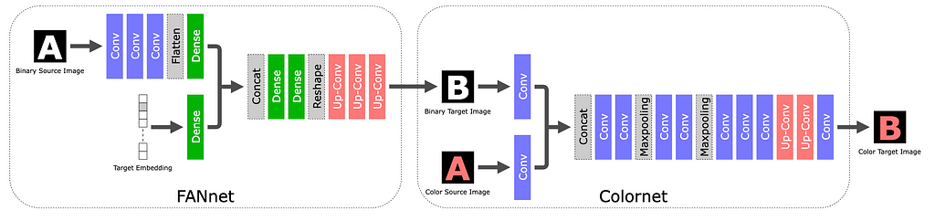
STEFANN, recognized as the first work to modify text in scene images, operates at a character level. The character editing problem is broken into two: font adaptation and color adaptation.
The STEFANN model architecture (source). The character editing task is broken into two: FANnet (Font Adaptation Network) generates a black-and-white target character in the desired shape, and Colornet fills in the appropriate color.
STEFANN is recognized as the first work to modify text in scene images. It builds on prior work in the space of font synthesis (the task of creating new fonts or text styles that closely resemble the ones observed in input data), and adds the constraint that the output needs to blend seamlessly back into the original image. Compared to previous work, STEFANN takes a pure machine learning approach (as opposed to e.g. explicit geometrical modeling) and does not depend on character recognition to label the source character.
The STEFANN model architecture is based on CNNs (Convolutional Neural Networks) and decomposes the problem into (1) font adaptation via FANnet — turning a binarized version of the source character into a binarized target character, (2) color adaptation via Colornet — colorizing the output of FANnet to match the rest of the text in the image, and (3) character placement — blending the target character back into the original image using previously-established techniques like inpainting and seam carving. The first two modules are trained with a GAN objective.
While STEFANN paved the way for Scene Text Editing, it has multiple limitations that restrict its use in practice. It can only operate on one character at a time; changing an entire word requires multiple calls (one per letter) and constrains the target word to have the same length as the source word. Also, the character placement algorithm in step (3) assumes that the characters are non-overlapping.
GAN Epoch #2: Word-Level Editing — SRNet and 3-Module Networks
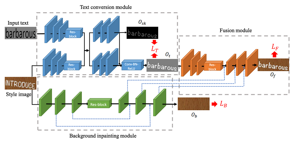
SRNet was the first model to perform scene text editing at the word level. SRNet decomposed the STE task into three (jointly-trained) modules: text conversion, background inpainting and fusion.
The SRNet model architecture. The three modules decompose the STE problem into smaller building blocks (text conversion, background inpainting and fusion), while being jointly trained. This architecture was largely adopted by follow-up work in the field.
SRNet was the first model to perform scene text editing at the word level. SRNet decomposed the STE task into three (jointly-trained) modules:
The text conversion module (in blue) takes a programatic rendering of the target text (“barbarous” in the figure above) and aims to render it in the same typeface as the input word (“introduce”) on a plain background.
The background inpainting module (in green) erases the text from the input image and fills in the gaps to reconstruct the original background.
The fusion module (in orange) pastes the rendered target text onto the background.
SRNet architecture. All three modules are flavors of Fully Convolutional Networks (FCNs), with the background inpainting module in particular resembling U-Net (an FCN with the specific property that encoder layers are skip-connected to decoder layers of the same size).
SRNet training. Each module has its own loss, and the network is jointly trained on the sum of losses (LT + LB + LF), where the latter two are trained via GAN. While this modularization is conceptually elegant, it comes with the drawback of requiring paired training data, with supervision for each intermediate step. Realistically, this can only be achieved with artificial data. For each data point, one chooses a random image (from a dataset like COCO), selects two arbitrary words from a dictionary, and renders them with an arbitrary typeface to simulate the “before” and “after” images. As a consequence, the training set doesn’t include any photorealistic examples (though it can somewhat generalize beyond rendered fonts).
Honorable mentions. SwapText followed the same GAN-based 3-module network approach to Scene Text Editing and proposed improvements to the text conversion module.
GAN Epoch #3: Self-supervised and Hybrid Networks
Leap to unsupervised learning. The next leap in STE research was to adopt a self-supervised training approach, where models are trained on unpaired data (i.e., a mere repository of images containing text). To achieve this, one had to remove the label-dependent intermediate losses LT and LB. And due to the design of GANs, the remaining final loss does not require a label either; the model is simply trained on the discriminator’s ability to distinguish between real images and the ones produced by the generator. TextStyleBrush pioneered self-supervised training for STE, while RewriteNet and MOSTEL made the best of both worlds by training in two stages: one supervised (advantage: abundance of synthetic labeled data) and one self-supervised (advantage: realism of natural unlabeled data).
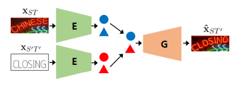
Disentangling text content & style. To remove the intermediate losses, TextStyleBrush and RewriteNet reframe the problem into disentangling text content from text style. To reiterate, the inputs to an STE system are (a) an image with original text, and (b) the desired text — more specifically, a programatic rendering of the desired text on a white or gray background, with a fixed font like Arial. The goal is to combine the style from (a) with the content from (b). In other words, we complementarily aim to discard the content from (a) and the style of (b). This is why it’s necessary to disentangle the text content from the style in a given image.
Inference architecture of RewriteNet. The encoder E disentangles text style (circle) from text content (triangle). The style embedding from the original image and content embedding from the text rendering are fed into a generator, which fuses the two into an output image.
TextStyleBrush and why GANs went out of fashion. While the idea of disentangling text content from style is straightforward, achieving it in practice required complicated architectures. TextStyleBrush, the most prominent paper in this category, used no less than seven jointly-trained subnetworks, a pre-trained typeface classifier, a pre-trained OCR model and multiple losses. Designing such a system must have been expensive, since all of these components require ablation studies to determine their effect. This, coupled with the fact that GANs are notoriously difficult to train (in theory, the generator and discriminator need to reach Nash equilibrium), made STE researchers eager to switch to diffusion models once they proved so apt for image generation.
The Diffusion Era (2022 — present)
At the beginning of 2022, the image generation world shifted away from GANs towards Latent Diffusion Models (LDM). A comprehensive explanation of LDMs is out of scope here, but you can refer to The Illustrated Stable Diffusion for an excellent tutorial. Here I will focus on the parts of the LDM architecture that are most relevant to the Scene Text Editing task.
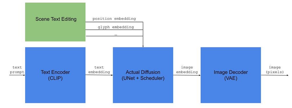
Diffusion-based Scene Text Editing. In addition to the text embedding passed to the actual diffusion module in a standard text-to-image-model, STE architectures also create embeddings that reflect desired properties of the target text (position, shape, style etc.). Illustration by the author.
As illustrated above, an LDM-based text-to-image model has three main components: (1) a text encoder — typically CLIP, (2) the actual diffusion module — which converts the text embedding into an image embedding in latent space, and (3) an image decoder — which upscales the latent image into a fully-sized image.
Scene Text Editing as a Diffusion Inpainting Task
Text-to-image is not the only paradigm supported by diffusion models. After all, CLIP is equally a text and image encoder, so the embedding passed to the image information creator module can also encode an image. In fact, it can encode any modality, or a concatenation of multiple inputs.
This is the principle behind inpainting, the task of modifying only a subregion of an input image based on given instructions, in a way that looks coherent with the rest of the image. The image information creator ingests an encoding that captures the input image, the mask of the region to be inpainted, and a textual instruction.
Scene Text Editing can be regarded as a specialized form of inpainting. Most of the STE research reduces to the following question: How can we augment the text embedding with additional information about the task (i.e., the original image, the desired text and its positioning, etc.)? Formally, this is known as conditional guidance.
Evidently, there needs to be a way of specifying where to make changes to the original image. This can be a text instruction (e.g. “Change the title at the bottom”), a granular indication of the text line, or more fine-grained positional information for each target character.
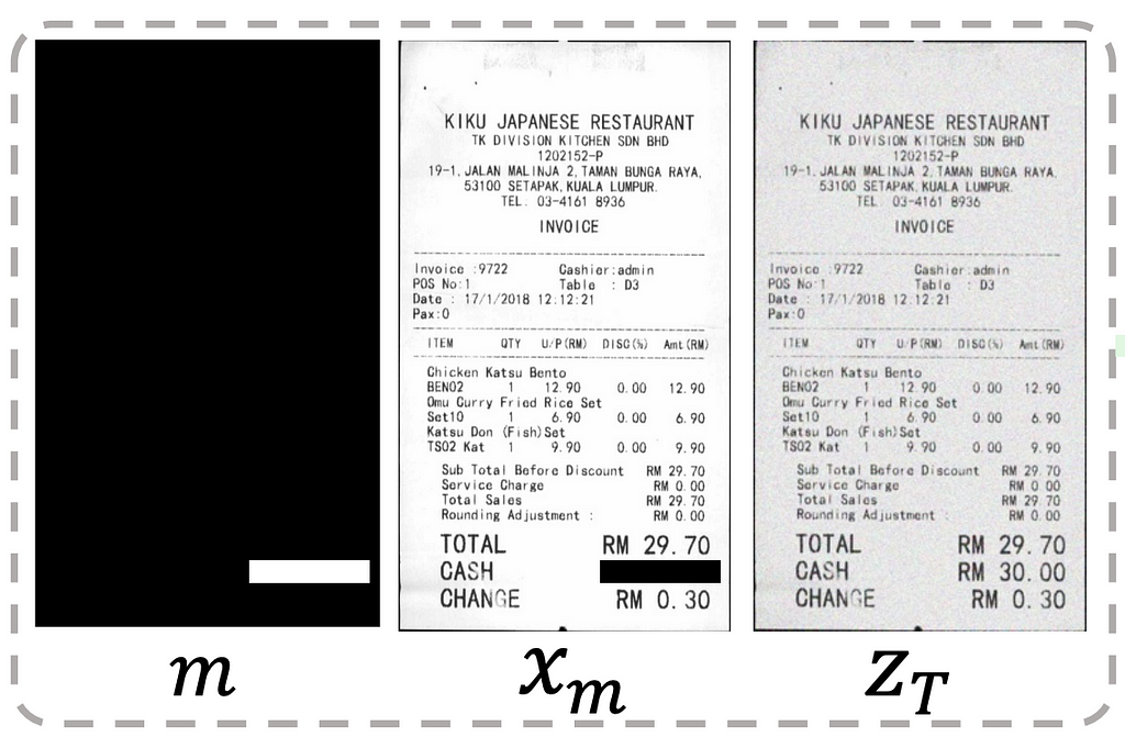
Positional guidance via image masks. One way of indicating the desired text position is via grayscale mask images, which can then be encoded into latent space via CLIP or an alternative image encoder. For instance, the DiffUTE model simply uses a black image with a white strip indicating the desired text location.
Input to the DiffUTE model. Positional guidance is achieved via the mask m and the masked input xm. These are deterministically rendered based on user input.
TextDiffuser produces character-level segmentation masks: first, it roughly renders the desired text in the right position (black text in Arial font on a white image), then passes this rendering through a segmenter to obtain a grayscale image with individual bounding boxes for each character. The segmenter is a U-Net model trained separately from the main network on 4M of synthetic instances.
Character-level segmentation mask used by TextDiffuser. The target word (“WORK”) is rendered with a standard font on a white background, then passed through a segmenter (U-Net) to obtain the grayscale mask.
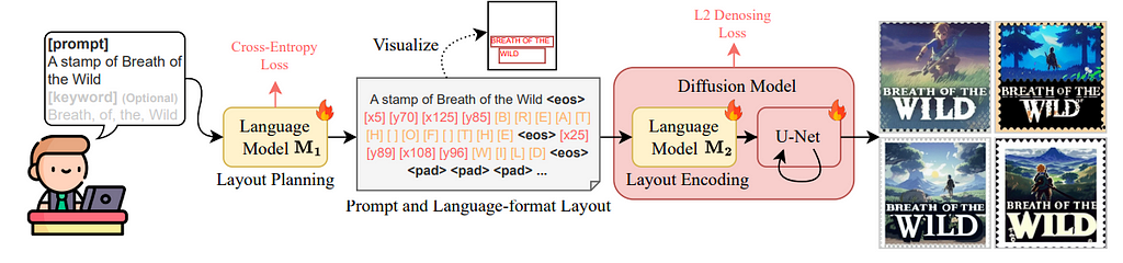
Positional guidance via language modeling. In A Unified Sequence Inference for Vision Tasks, the authors show that large language models (LLMs) can act as effective descriptors of object positions within an image by simply generating numerical tokens. Arguably, this was an unintuitive discovery. Since LLMs learn language based on statistical frequency (i.e., by observing how often tokens occur in the same context), it feels unrealistic to expect them to generate the right numerical tokens. But the massive scale of current LLMs often defies our expectations nowadays.
TextDiffuser 2 leverage this discovery in an interesting way. They fine-tune an LLM on a synthetic corpus of <text, OCR detection> pairs, teaching it to generate the top-left and bottom-right coordinates of text bounding boxes, as show in the figure below. Notably, they decide to generate bounding boxes for text lines (as opposed to characters), giving the image generator more flexibility. They also run an interesting ablation study that uses a single point to encode text position (either top-left or center of the box), but observe poorer spelling performance — the model often hallucinates additional characters when not explicitly told where the text should end.
Architecture of TextDiffuser 2. The language model M1 takes the target text from the user, then splits it into lines and predicts their positions as [x1] [y1] [x2] [y2] tokens. The language model M2 is a fine-tuned version of CLIP that encodes the modified prompt (which includes text lines and their positions) into latent space.
Glyph guidance
In addition to position, another piece of information that can be fed into the image generator is the shape of the characters. One could argue that shape information is redundant. After all, when we prompt a text-to-image model to generate a flamingo, we generally don’t need to pass any additional information about its long legs or the color of its feathers — the model has presumably learnt these details from the training data. However, in practice, the trainings sets (such as Stable Diffusion’s LAION-5B) are dominated by natural pictures, in which text is underrepresented (and non-Latin scripts even more so).
Multiple studies (DiffUTE, GlyphControl, GlyphDraw, GlyphDiffusion, AnyText etc.) attempt to make up for this imbalance via explicit glyph guidance — effectively rendering the glyphs programmatically with a standard font, and then passing an encoding of the rendering to the image generator. Some simply place the glyphs in the center of the additional image, some close to the target positions (reminiscent of ControlNet).
STE via Diffusion is (Still) Complicated
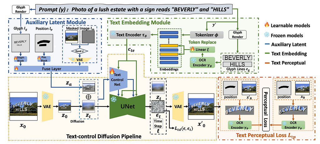
While the training process for diffusion models is more stable than GANs, the diffusion architectures for STE in particular are still quite complicated. The figure below shows the AnyText architecture, which includes (1) an auxiliary latent module (including the positional and glyph guidance discussed above), (2) a text embedding module that, among other components, requires a pre-trained OCR module, and (3) the standard diffusion pipeline for image generation. It is hard to argue this is conceptually much simpler than the GAN-based TextStyleBrush.
When the status quo is too complicated, we have a natural tendency to keep working on it until it converges to a clean solution. In a way, this is what happened to the natural language processing field: computational linguistics theories, grammars, dependency parsing — all collapsed under Transformers, which make a very simple statement: the meaning of a token depends on all others around it. Evidently, Scene Text Editing is miles away from this clarity. Architectures contain many jointly-trained subnetworks, pre-trained components, and require specific training data.
Text-to-image models will inevitably become better at certain aspects of text generation (spelling, typeface diversity, and how crisp the characters look), with the right amount and quality of training data. But controllability will remain a problem for a much longer time. And even when models do eventually learn to follow your instructions to the t, the text-to-image paradigm might still be a subpar user experience — would you rather describe the position, look and feel of a piece of text in excruciating detail, or would you rather just draw an approximate box and choose an inspiration color from a color picker?
Epilogue: Preventing Abuse
Generative AI has brought to light many ethical questions, from authorship / copyright / licensing to authenticity and misinformation. While all these loom large in our common psyche and manifest in various abstract ways, the misuses of Scene Text Editing are down-to-earth and obvious — people faking documents.
While building Textify, we’ve seen it all. Some people bump up their follower count in Instagram screenshots. Others increase their running speed in Strava screenshots. And yes, some attempt to fake IDs, credit cards and diplomas. The temporary solution is to build classifiers for certain types of documents and simply refuse to edit them, but, long-term the generative AI community needs to invest in automated ways of determining document authenticity, be it a text snippet, an image or a video.
Norwegian startup ClexBio is bioengineering human veins to implant inside a patient’s body. Together with CSEM, a Swiss R&D centre, the company has built a prototype bioreactor to grow the veins. Pre-clinical tests in animal models are already underway. Based on the early results, the team is confident that the implants don’t trigger an immune response in patients. Instead, they turn into functional tissue that integrates with the body. If further tests prove successful, the implants could treat severe chronic venous insufficiency, a painful condition caused when veins have problems moving blood to the heart. But veins are just the start…
Windows Photos gets ‘Magic Eraser’ AI feature: Here’s how to use it
Originally appeared here:
Windows Photos gets ‘Magic Eraser’ AI feature: Here’s how to use it
We use cookies on our website to give you the most relevant experience by remembering your preferences and repeat visits. By clicking “Accept”, you consent to the use of ALL the cookies.
This website uses cookies to improve your experience while you navigate through the website. Out of these, the cookies that are categorized as necessary are stored on your browser as they are essential for the working of basic functionalities of the website. We also use third-party cookies that help us analyze and understand how you use this website. These cookies will be stored in your browser only with your consent. You also have the option to opt-out of these cookies. But opting out of some of these cookies may affect your browsing experience.
Necessary cookies are absolutely essential for the website to function properly. These cookies ensure basic functionalities and security features of the website, anonymously.
Cookie
Duration
Description
cookielawinfo-checkbox-analytics
11 months
This cookie is set by GDPR Cookie Consent plugin. The cookie is used to store the user consent for the cookies in the category "Analytics".
cookielawinfo-checkbox-functional
11 months
The cookie is set by GDPR cookie consent to record the user consent for the cookies in the category "Functional".
cookielawinfo-checkbox-necessary
11 months
This cookie is set by GDPR Cookie Consent plugin. The cookies is used to store the user consent for the cookies in the category "Necessary".
cookielawinfo-checkbox-others
11 months
This cookie is set by GDPR Cookie Consent plugin. The cookie is used to store the user consent for the cookies in the category "Other.
cookielawinfo-checkbox-performance
11 months
This cookie is set by GDPR Cookie Consent plugin. The cookie is used to store the user consent for the cookies in the category "Performance".
viewed_cookie_policy
11 months
The cookie is set by the GDPR Cookie Consent plugin and is used to store whether or not user has consented to the use of cookies. It does not store any personal data.
Functional cookies help to perform certain functionalities like sharing the content of the website on social media platforms, collect feedbacks, and other third-party features.
Performance cookies are used to understand and analyze the key performance indexes of the website which helps in delivering a better user experience for the visitors.
Analytical cookies are used to understand how visitors interact with the website. These cookies help provide information on metrics the number of visitors, bounce rate, traffic source, etc.
Advertisement cookies are used to provide visitors with relevant ads and marketing campaigns. These cookies track visitors across websites and collect information to provide customized ads.